Designated on the cover as suitable for both adults and children, the text box was surely meant to notify parents that this comic was safe to read after the national scandal over comic books that led to the oversight of the Comics Code Authority.
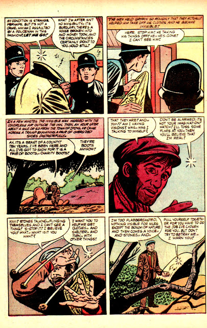
In the on-line article by Ken Parille in THE COMICS JOURNAL (June 2, 2014) he has this to say about Morisi's work:
"Unlike Sienkiewicz and Steranko, Morisi executes interesting effects without drawing much attention to his art. His peculiar visual approach continually unravels — even deadens — a plot’s tension, working against the excitement that comic-book readers expected and demanded. He’s a subtle and strange artist.Much of his energy lives not in panel-to-panel flow but in the framed confines of the panel, in flat images on lifeless pages. ... His peculiar genius lies in the way he seems to disrupt our desire to glide across a page. While it’s hard to talk about the specific effect that images have on us, many of his panels feel calming, almost a little hypnotic and "sculptural" ... The characters’ faces and the comic's text reveal an odd disconnect: the dialogue and narration convey the situation's drama, yet the facial expressions don't. People stare off somewhere beyond the panel, disengaged from the plot and from each other, counteracting the intensity that the text's many exclamations points are supposed to carry. This disconnect lends Morisi's Charlton work an odd, subdued pathos."This dense and varied line work gives their art and pages an inherent sense of action. But Morisi stayed with his 1950’s George Tuska/Alex Toth-like approach. His accurate, old-fashioned ink line adds to his art’s tranquility, just as it set him apart from contemporary comics, in which peril and panic were omnipresent.Artists who worked in horror and adventure genres often followed in the [Neal] Adams’s tradition. Many whose art appeared in Charlton comics alongside Morisi’s tended toward a wavier, often scratchier ink line, and their drawings typically used far more lines than his."
Canadian cartoonist Seth made an astute observation about the "stillness" of a comic book page, and it relates to Morisi's style:
"There is something very lovely about the stillness of a comic book page. That austere stacked grid of boxes. The little people trapped in time. Its frozen and silent nature acting almost as a counterpoint to the raucous vulgarity of the modern aesthetic. Of course, the drawings aren’t really frozen. When we look at them, we immediately invest them with life. That little ink world pops into life as our eyes move across the drawings. I actually find it very difficult to look at a cartoon and hold on to the stillness. The essence of the cartoon language carries a kind of animation with it. This is true even with a single drawing, but it is especially evident when one panel is placed next to another. That juxtaposition creates a tension that implies motion and time."
NOTE: Third-party ads have been removed from this scan.
Read THE COMICS JOURNAL full article on Pete Morisi HERE.


No comments:
Post a Comment